There is less chance of a bad visual design making a bad presentation.
Thu Mar 20
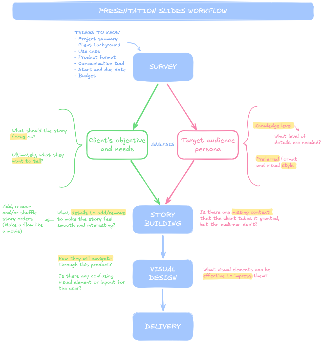
Sometimes, my clients ask me to improve their presentation slide designs. By working on this kind of project, I found more often than not that the core solution is not visual design but the structure and phrasing, just like how a good movie is improved.
- The original draft feels too scattered by many off-topics they want to mention… If the client could choose only one thing to tell, what would it be?
- From an outsider’s point of view, I see their story misses a context here and there. Too many out-of-blue scenes… How and what is the target audience informed about, and how can I improve the slides based on their knowledge level?
Things like that. This principle doesn’t only apply to presentation projects. It’s universal — by figuring out the core issue, the fundamental solution, and the limitations to consider, you can effectively deliver the best output while saving time and energy.
The role of visual design should sorely be enhancing the characteristics of the content.
Below is my workflow summary and a project example that led my client to win a business plan contest.