GIMP is probably the most famous, Photoshop-like free and open-source image editor. I always recommend this program to engineers who occasionally need a PSD viewer or editor, but with a little hesitation...
Fri Jan 23
UPDATE (2026-07-06):
A GIMP developer responded to the article version of this content. They have volunteer designers who help the developers discuss, design, and implement feedback.Here is the UX design site where you can actually influence GIMP’s project direction by sharing your opinions: https://gitlab.gnome.org/Teams/GIMP/Design/gimp-ux/-/work_items
Alex, thank you for the kind feedback!
* This article is a digested summary of this video on YouTube:
GIMP is probably the most famous FOSS image editor. It’s known for/as:
- A free and open-source image editor
- A Photoshop alternative
- The feature-richness
- Decent PSD format compatibility
- The steep learning curve
I always recommend this program to engineers who occasionally need a PSD viewer or editor, but with a little hesitation…
Yes, because the steep learning curve makes it difficult to use. Even as a designer who learned the layer system with GIMP (ver. 1.2.0), it feels still steep…
So, what makes GIMP this difficult?
The Problems (& Table Of Contents)
I think there are two main reasons that make GIMP difficult to use:
While obviously I can’t change the project’s direction, I still can share my ideas on improving the UI and UX. Let’s look into it…
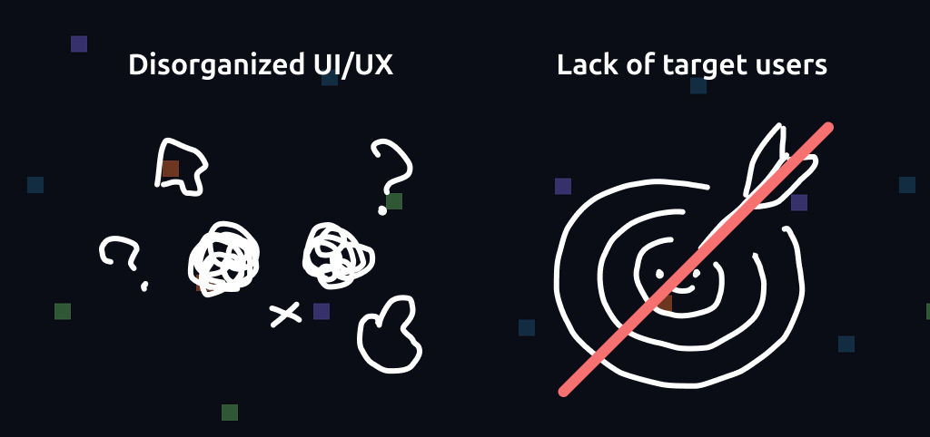
1. The Disorganized UI/UX
1-1. Navigation
With the default UI layout, I have to navigate a long distance throughout the window to configure a brush. Fundamentally, the more you have to search for the position of the next tool, the more you’ll get the chance of a little decision fatigue.
Fortunately, this problem can easily be solved by arranging the panel layout.
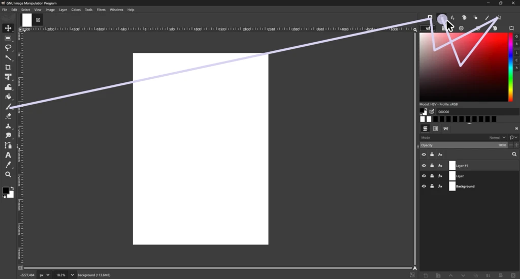
Customizing the panel layout is easy, but it’s a kind of exception. From now on, I’d like to show how I would recreate the interface.
1-2. Colors
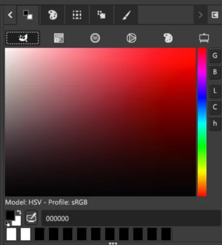
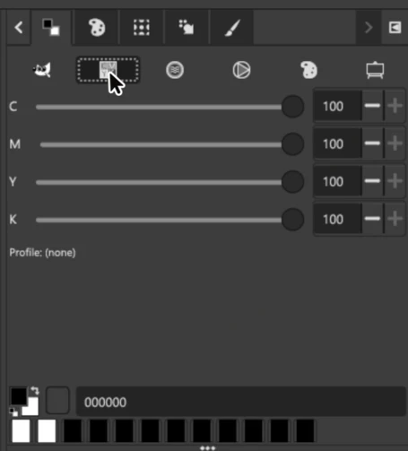
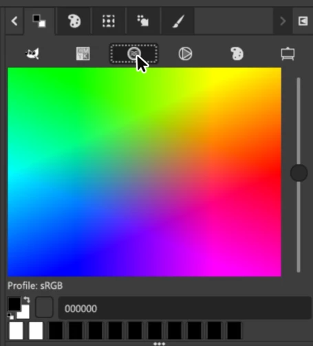
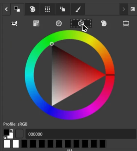
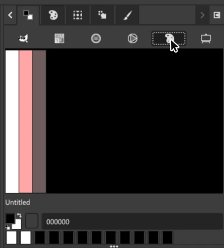
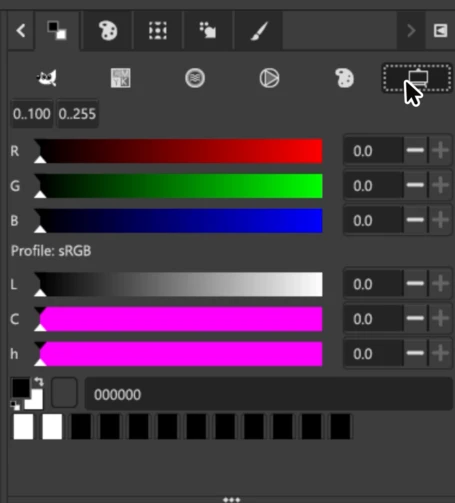
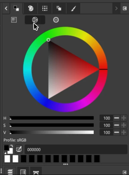
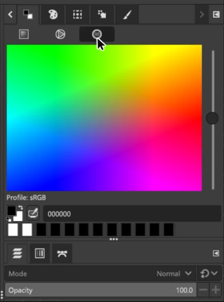
GIMP has six types of color pickers: GIMP, CMYK, Watercolor, Wheel, Palette, and Scales. A few questions popped up in my mind:
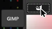
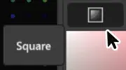
- Why is a classic square-shaped color picker named “GIMP”?
- The CMYK panel does not have a visual spectrum. (Instead, it has a HEX textbox which only works with RGB color mode)
If I recreate the interface, I would:
- Unify the color spectrum (GIMP) and values (Scale) into a single panel.
- This way, I can roughly choose a color and then adjust the precise values after.
- Add some dropdown-style selectors to the same panel.
- CMYK selector to choose a color in the same manner as 1 when soft-proofing is enabled.
- Adding an HSV/LCh selector in addition will simplify the color picking flow by removing two panels (“CMYK” and “Scale”).
- Apply the similar modifications to the “Wheel” and the “Watercolor”.
- Remove the “Palette”. It looks like a duplicate of “Palette Editor” but with no editing ability.
Also, I would modify:
- The panel name “GIMP” to something related to the panel’s characteristic (“Square”)
- Standardize the name of this panel. It uses “Colors” on the “Add a Tab” list, but “FG/BG Color” in a tooltip.
- Change the default tab appearance settings from the “state of the tool” to “icon”.
- Beginners would be confused if the tab icon changes each time a different sub-option is selected.
1-3. Palettes
These two text fields on top and bottom are a little tricky.
“Filter” obviously exists to filter the list. However, by default, you will see no filter option available. To use the filter, you have to have at least one palette that has a tag. So, the “Enter tags” field on bottom helps you add a filter option = tag.
Two fields for different purposes share the same look and no hint of their usages. This is very confusing.
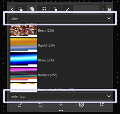
I think that these fields should be unified so users can naturally find where they can modify anything related to the palette list.
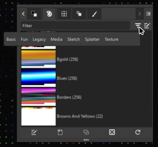
To assign different roles to this text field, I would add a “Filter” and an “Edit” button.
- By clicking the “Filter” button, you can see what filter options are available
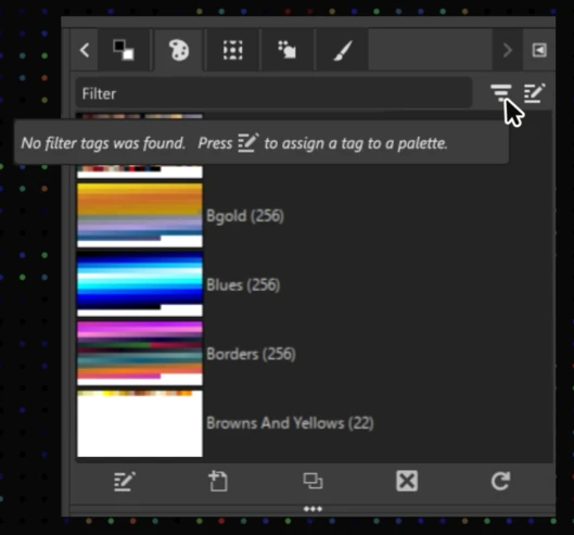
- Or a short instruction about “how you can add an option” if nothing is registered.
- The “Edit” button toggles the text field’s function between Tag Editor mode and Filter mode.
- So, you can assign tags from the same text field.
Edit button: It toggles between Tag editor mode and Filter mode
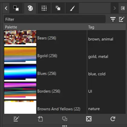
Or, I would just make a “Tag” column where you can edit tags directly.
1-4. Default Selections Of The Palettes
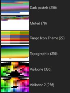
Let me be honest about the default selection… Most of the palettes seem randomly added without having a standard.
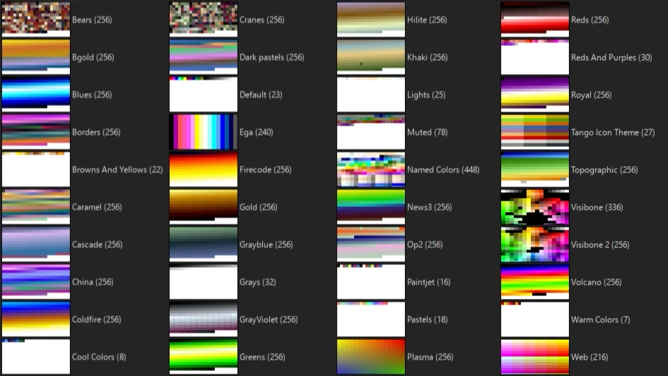
Some palettes are practical. For example, the “Web” palette is nice for designers and developers. But other palettes, especially these two are bizarre choices for a graphic editor:
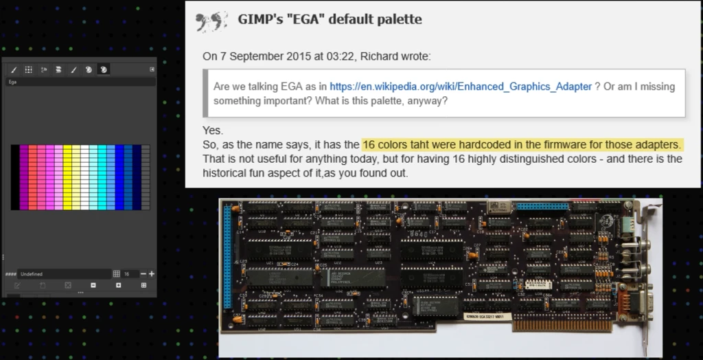
- EGA: A 1980s technical color scheme
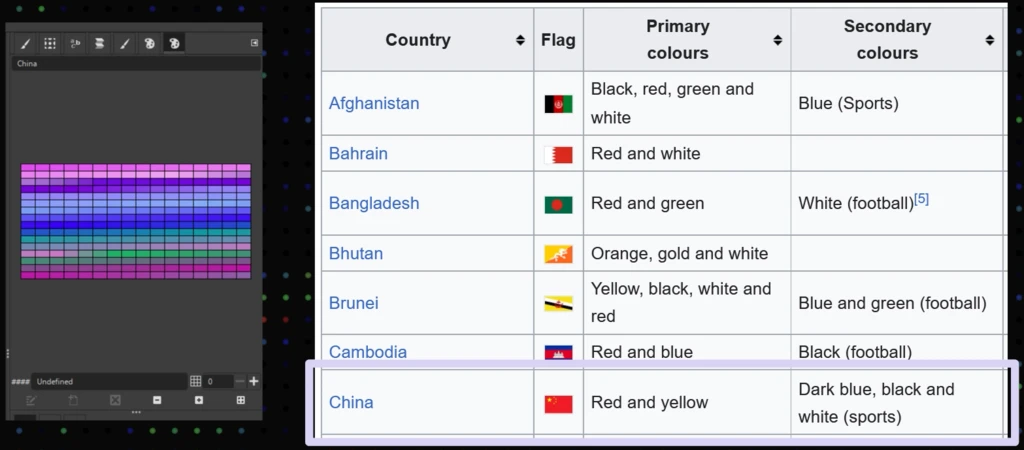
- China: A cool-colored palette (while China’s national color is red)
If I could select what should be the defaults, I would
- Keep only a few palettes from what’s available now
- Add more useful colors:
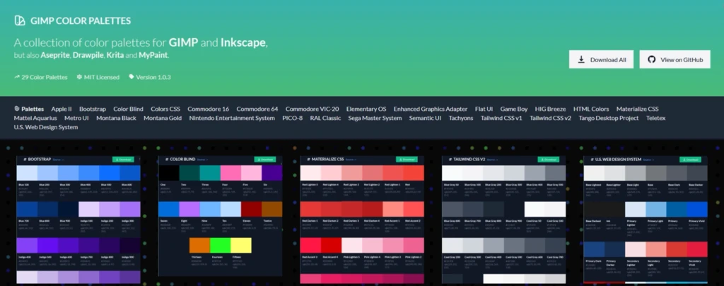
- For IT people, things listed on the GIMP Color Palettes
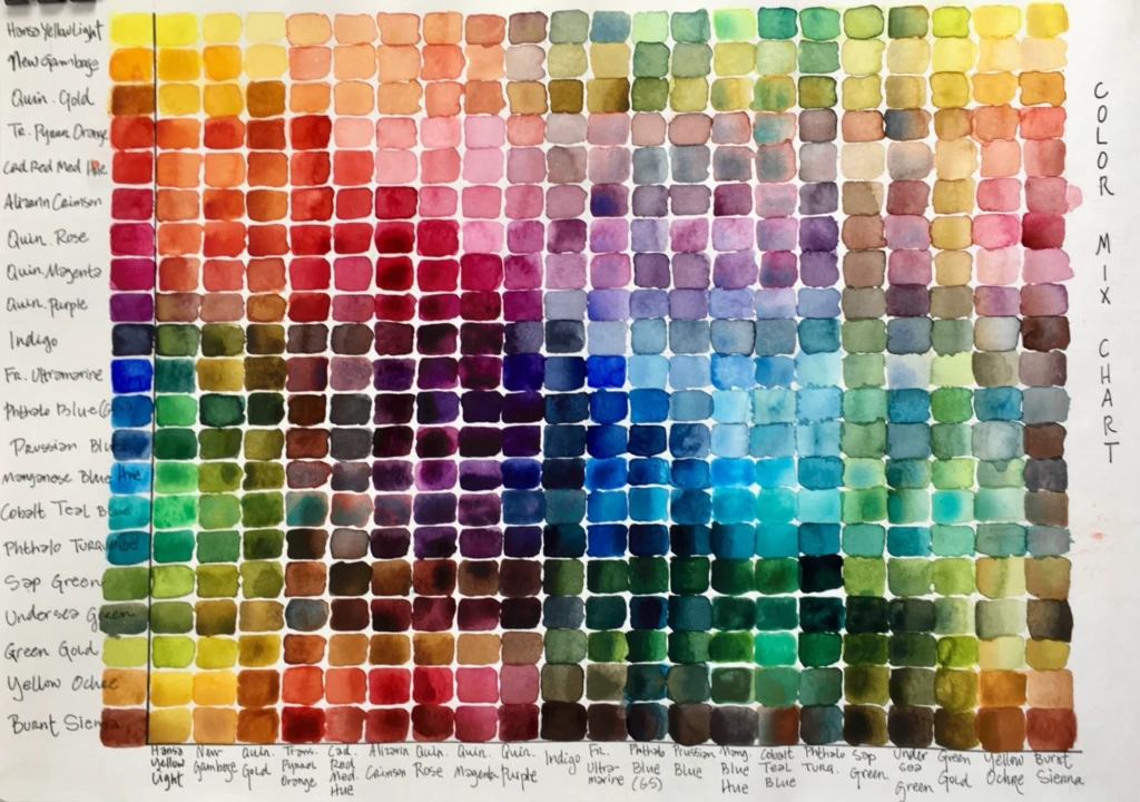
- For graphic people, something that covers this spectrum (Sorry, I didn’t find an exact palette)
+
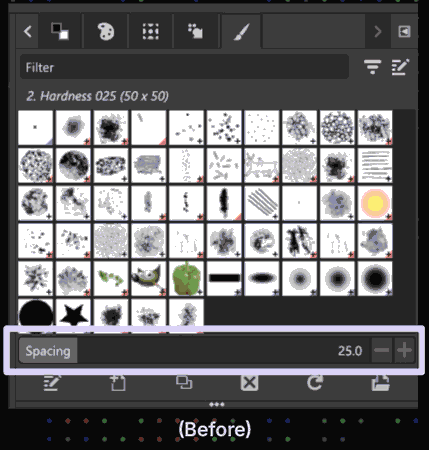
1-5. Brushes
To the Brush panel, I would apply the same Filter/Edit mode UI. And, I would also:
- Remove the “spacing” slider
- Or replace it with a “brush size” bar (“spacing” is a more advanced and less demanded feature than this one)
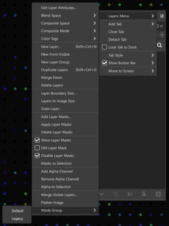
1-6. Layers
At a glance, the Layer panel looks nice, but…
Why does my brain recognize the Windows Update icon from a pulldown menu? And why is Wilber becoming crazy here?
Well. Seriously, they are the switchers of default/legacy layer modes.
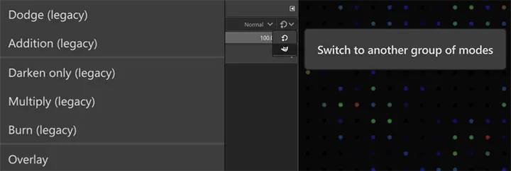
However, I don’t think that this switcher should grab attention 7 years after the legacy mode retired its primary role. To keep it compatible, I would not remove the options but push them to the backstage/backyard instead. Let’s name it “Mode Group”.
1-7. Menus
(This section is long and complex. So, I picked up a few issues from the original video. For the full list, please watch it here.)1-7-1. Icons in the List: File and Edit
Icons in the list can help finding important functions easy. Though, I don’t think the (make/generate? from) “Screenshot” is a frequently used feature. So why give this a chance to disrupt the visual harmony?
The same goes for “Fill with” menus. (These might be frequently used features, but I would remove the icons since the frequent change of the selected colors/pattern could rather cause a cognitive issue.)
1-7-2. Misfit Categories and Duplicates: Select and View
Select
- Float is a collection of copy/paste operations. So, move this to “Edit”.
View
- Remove the “Navigation Window” in this category. It also exists in the
Window > Dockable Dialogsmenu. - Instead, move the
Image > Guidesto here.
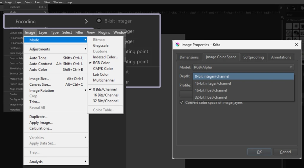
1-7-3. The Use of Standard Terms: Image and Layer
- The standard term of “Encoding” in image editing is “Color Depth”.
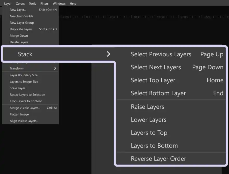
- “Layer Stack” or “Layer Order” can make more sense for “Stack”.
Note: I found out that the term “Stack” is commonly used in the software engineering domain to refer to a similar concept to the “Layer Order” or “Layer Group”
1-7-4. Item Order: Windows and Help
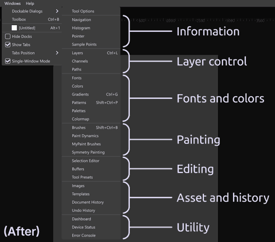
Windows
The items inside the “Dockable Dialogs” can be much easier to find if they are ordered by functional similarity.
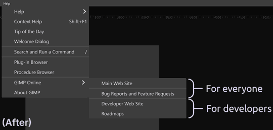
Help
The number of links that go to the same online help page is… Confusing. I think having the “User Manual” section is enough. Plus, this “GIMP Online” section can be more organized if it’s grouped by target audience.
The Unclear Direction of the Project and the Lack of Target Users
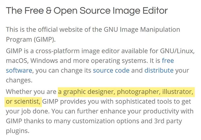
From what I’ve done, I assume the GIMP’s biggest problem is the lack of clarification of its target users. As it’s said, “Know your enemies”. Specifying who to target is an essential step to set a project’s future direction, goals, and priorities.According to the official website, basically, GIMP is for everyone. But, I don’t think it’s accurate, especially since they also claimed that they don’t care about the industrial standard or the familiar way to do things.
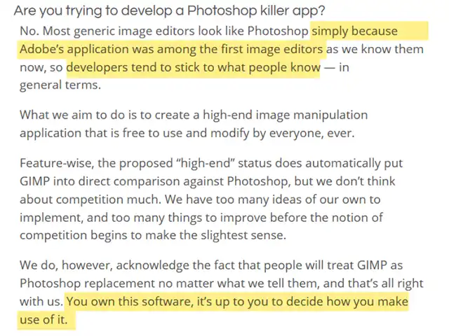
Yes, the standard way is not always the best way. However, can you imagine what enabled the global population to adopt computer technology when the concept of the non-physical document was totally new?
Oftentimes, a standard way has an obvious reason to be standard. And, if you want to offer the other way, you cannot just go top-down, but instead, you must speak in their language.
So, you must know who is them.
Final Thoughts
Although making a clarification is up to the GIMP team, sharing our opinions is still important. You can either contribute, give feedback, make tutorial videos, or even build your own wiki.
This way, you can help ease the steep learning curve of a valuable yet difficult tool. And, perhaps your “better way” will grab the attention of a few contributors.
References
- GIMP: https://www.gimp.org/
- EGA palette:
- National colors: https://en.wikipedia.org/wiki/National_colours
- GIMP Color Palettes: https://robert-96.github.io/gimp-color-palettes/
- Watercolor palette: https://charlenecollinsfreeman.com/blog-montauk/2017/3/6/my-color-sketchbook
- “Introducing Lisa” ad: https://guidebookgallery.org/ads/magazines/lisa/introducinglisa